Product designer & frontend
developer based in New York.
Designing a professional platform for creatives in music2019
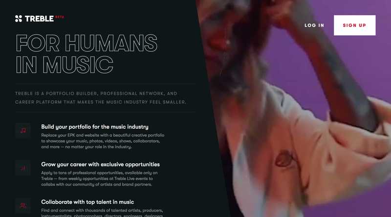
Treble is a music tech company focused on 'un-scattering' the music industry by helping creatives collaborate through its digital platform and live events. When I joined the company in late 2018, its digital platform was in need of some new life.
As the lead product designer, my task was to reimagine the digital platform — which had lost momentum after being featured on the App Store and gaining a passionate userbase a year prior — and design a focused, scalable product to serve the needs of our thriving live community and creatives in the music world at large.
Grounded in research
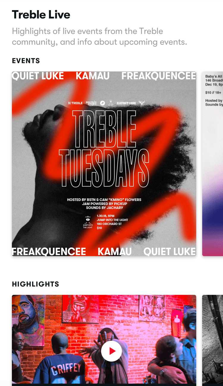
While the digital platform was losing steam, Treble's live events were booming, especially the weekly meetup Treble Tuesdays and Treble's stage at SXSW. The artists and industry folk attending Treble events every week were a perfect microcosm of the industry and essential to rebooting the core digital product. If the platform was to succeed at all, it would first have to succeed for them.
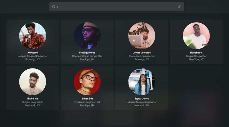
So, I started by conducting user interviews over the course of a month with our community members, broken up into five archetypes: recording artists, producers, instrumentalists, visual artists, and engineers. It was clear they loved how easy it was to find gigs and collaborators on the app, but vetting the quality of other users' work was difficult. They wanted to use Treble to 1) find and evaluate potential collaborators' work, 2) show off their own work, and 3) find quality paid gigs and opportunities.
As the research phase went on, it became clear that a bigger change was also necessary: moving the platform from an iOS app to a web app optimized for work stations. What was once a simple listings and messaging app a la Craigslist was turning into a professional portfolio builder, more akin to LinkedIn or Behance.
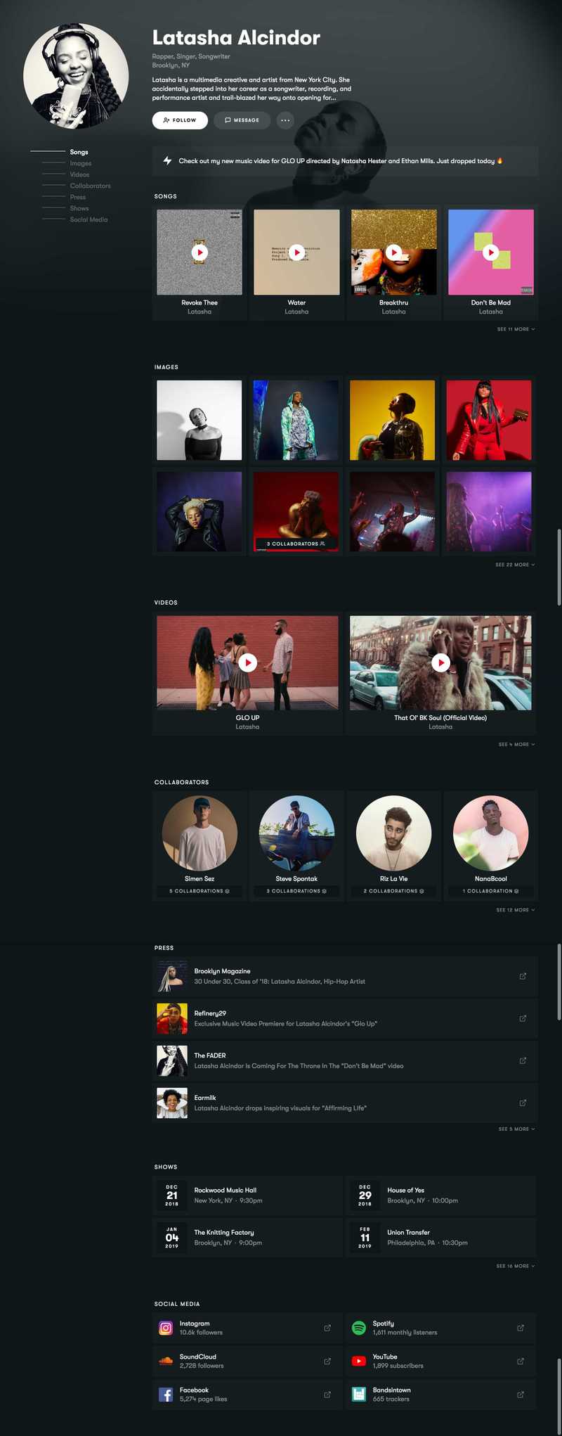
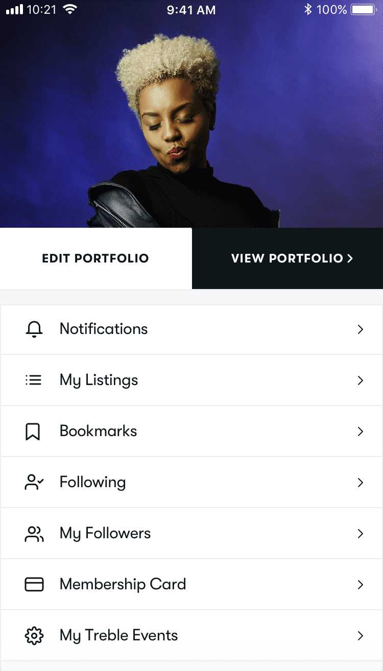
The Treble portfolio
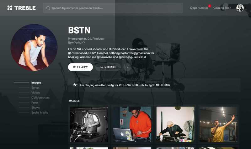
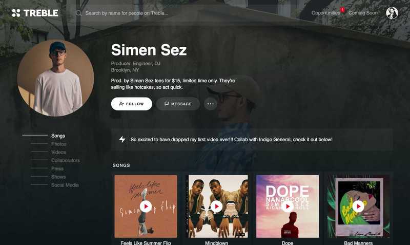
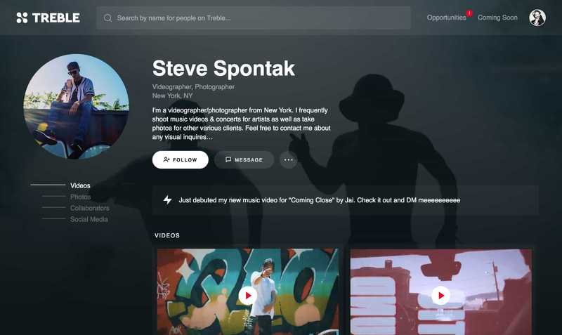
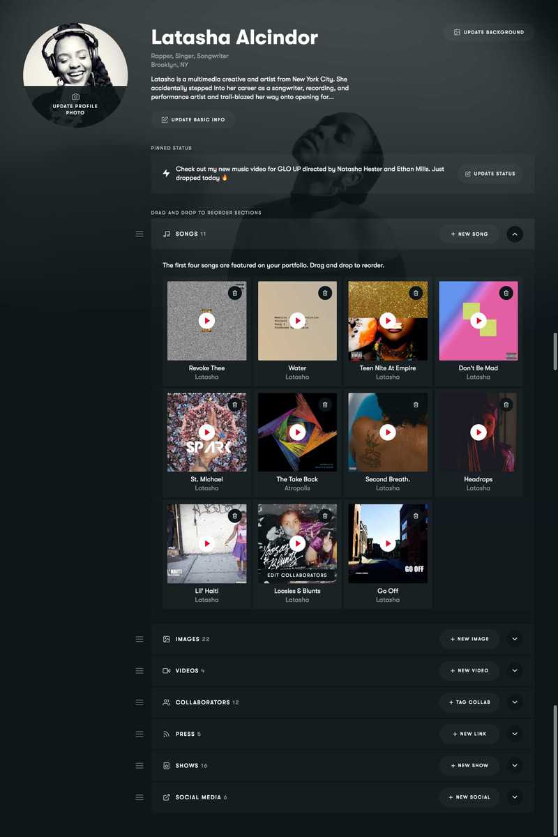
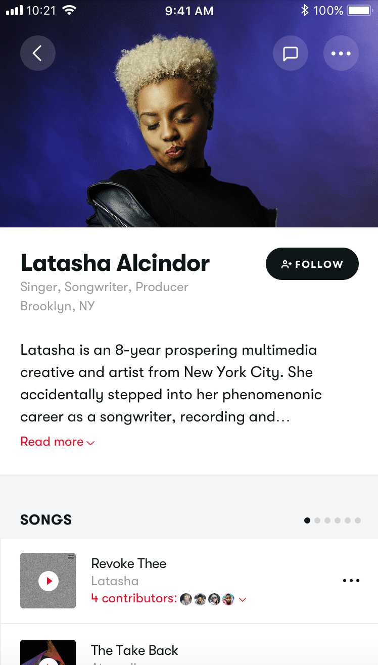
To solve for the dual problem of making it easier for users to explore others' work and showcase their own work, we decided to center the platform around more robust user portfolios. Given the different needs of different types of music professionals — singers, designers, mixers, stylists, etc. — it was a challenge to design a solution that would be standardized enough to be intuitively usable yet flexible enough to cater to each archetype, especially in such an image-conscious and personality-driven industry.
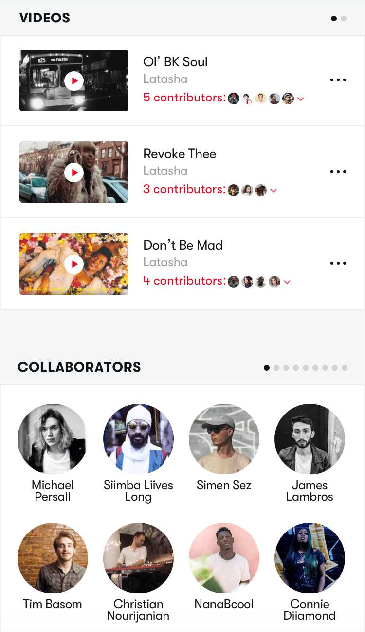
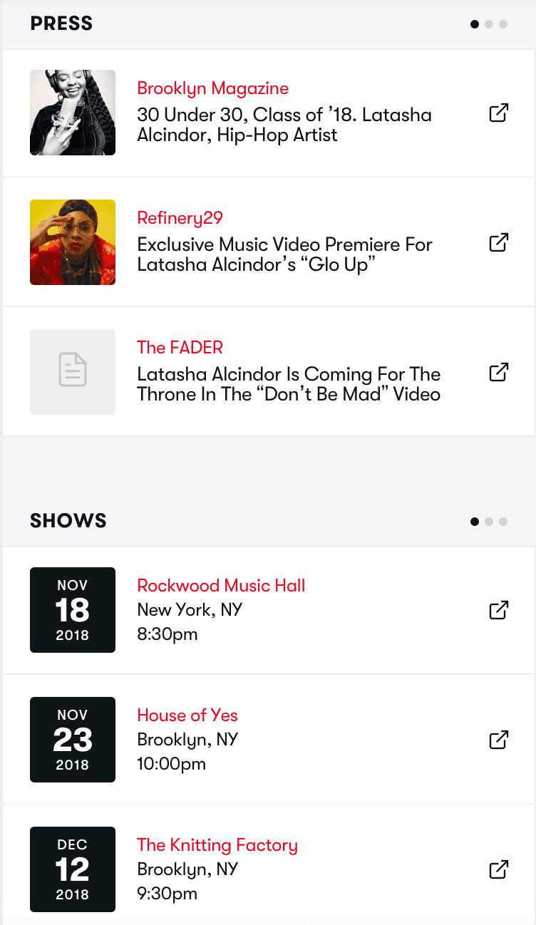
Two design decisions helped me tackle this challenge: 1) constructing portfolios based on content modules that users could opt to publish and drag-and-drop to reorder, and 2) emphasizing a user's content to make porffolios feel more customized. Allowing a user to upload a background photo and fill the foreground content with their own album covers, images, and videos ensures no two portfolios look too similar. Moreover, the content modules allow for, say, a photographer to put their images first where a singer can showcase their songs first. Module options include songs, images, videos, collaborators, press, shows, and social media.
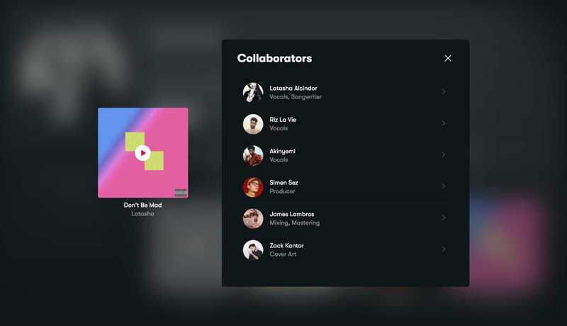
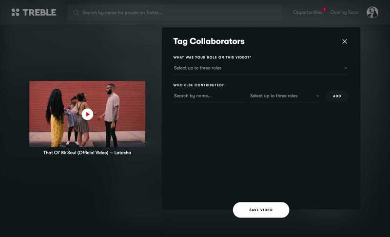
Emphasizing collaborators
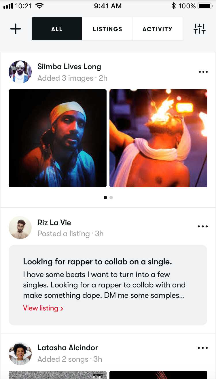
Another common point of feedback during the research phase was how important it is to see who somebody has previously worked with. To account for this, I designed a feature to tag a collaborator on any song, image, or video. If that user is on the platform, it simply links to their portfolio; if not, the tagger can choose to invite them to join Treble. Collaborators tagged on any of a user's work are then highlighted on their portfolio, which offers immediate validation and an engaging way to find new collaborators within a trusted source's professional circle.
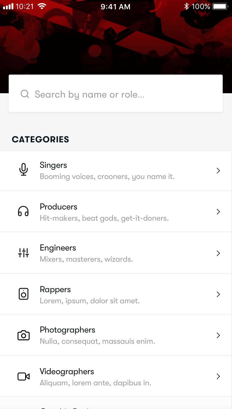
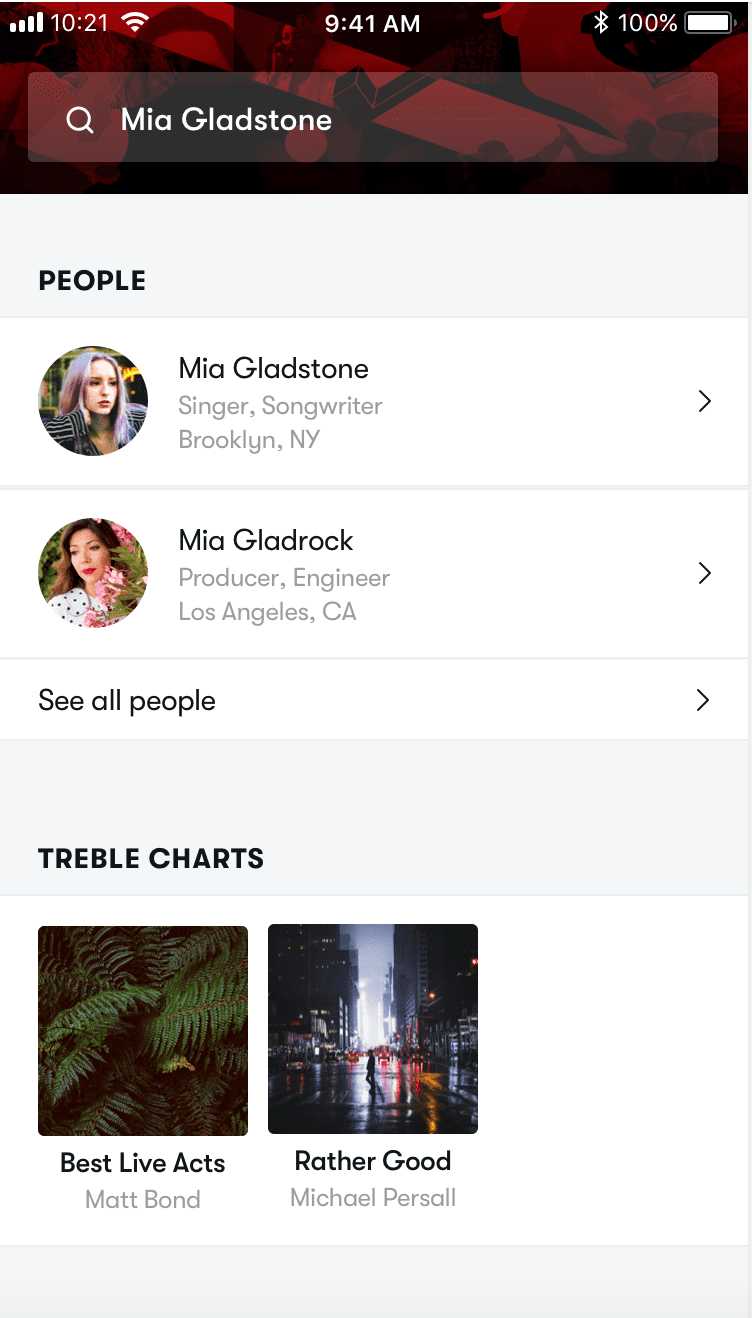
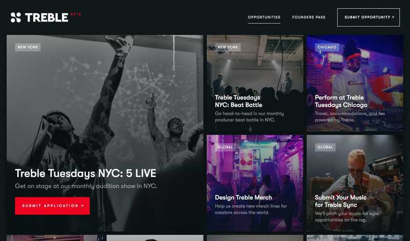
Discovery and curated content
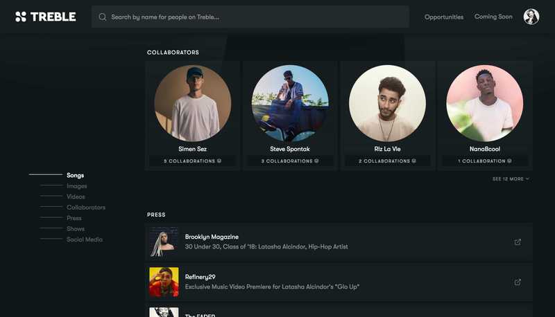
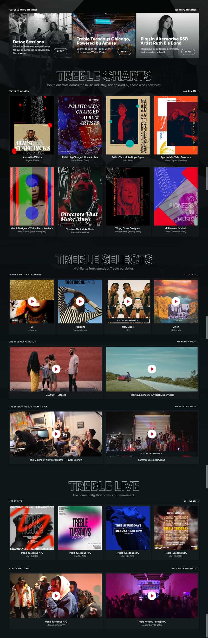
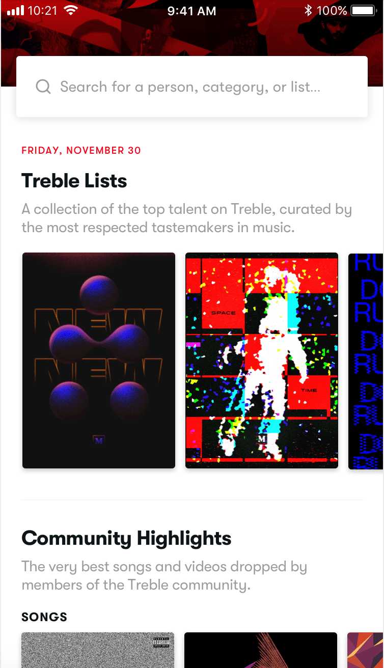
To make it easier to find quality potential collaborators on Treble (rather than relying on a feed of listings with no context about the person posting), I designed a curated editorial page to showcase the top users on Treble.
Treble Charts are lists of top-notch professionals for specific use cases, such as directors that specialize in music videos or guitarists that can seamlessly fill in on a band's gig. To add legitimacy to these lists, many Treble Charts would be selected by recognizable, respected names in the industry. Treble Selects offers another form of exploration, as well as recognition of community members, by highlighting the top content published on Treble portfolios.
Beyond finding collaborators, most users simply want to find (paid!) work, but it is often very hard to find accessible opportunities. To help bridge that gap, the Discover page also offers tons of quality opportunities sourced by Treble sponsors and partner companies. Users can apply to these opportunities by submitting their portfolios for consideration, also offering a strong incentive to ensure the quality of the portfolios on the platform.
Outcome and outlook
This project was a huge undertaking that exposed me to just about every aspect of building a scalable digital product from scratch. The most important lesson I learned was how deeply essential it is to conduct intentional and intensive research to build something that solves a real need. Making our community members an integral part of the redesign gave us confidence that when the platform launches to the public in early 2020, it will tangibly help them advance their careers in music.
Redesigning an iOS app to help musicians connect and collaborate2018
Before making the decision to fully rebuild Treble's digital platform for the browser, I took it upon myself to redesign the iOS app. I did this for two main reasons: 1) as an exercise to get up to speed with the existing Treble platform and make sure I fully understood what it did well and what it needed to improve, and 2) to test out new features and concepts as we conducted interviews with our community members.
This proved to be a hugely helpful part of my process and laid the groundwork for the full redesign for desktop that I'd later complete. Based on feedback we received from the interviews, my main design goals were to create a more robust user portfolio and rethink the listings feed that our community used to connect with new collaborators.
Revamping the portfolio
In the first version of the Treble iOS app, user profiles were pretty barebones. The only information you could glean by looking at somebody's profile was their name, location, role, and SoundCloud songs. This wasn't very helpful when trying to evaluate whether to work with somebody listing a gig or opportunity. It wasn't enough context to fully get a sense of their work, brand, or career stage. Furthermore, by limiting the only work samples to SoundCloud songs, the platform heavily favored recording artists. Our research, however, showed that the main problem to solve was connecting musicians with visual artists, engineers, and producers.
So, I rebuilt the user profile page from the ground up to include not only songs, but also a bio, images, videos, press links, and social media (with contextual stats). Additionally, a user could list their collaborators on any work sample to enable deeper discovery. These additional content types not only offered more context about community members, but also made the platform far more useful to non-recording artists.
Building a more relevant listings feed
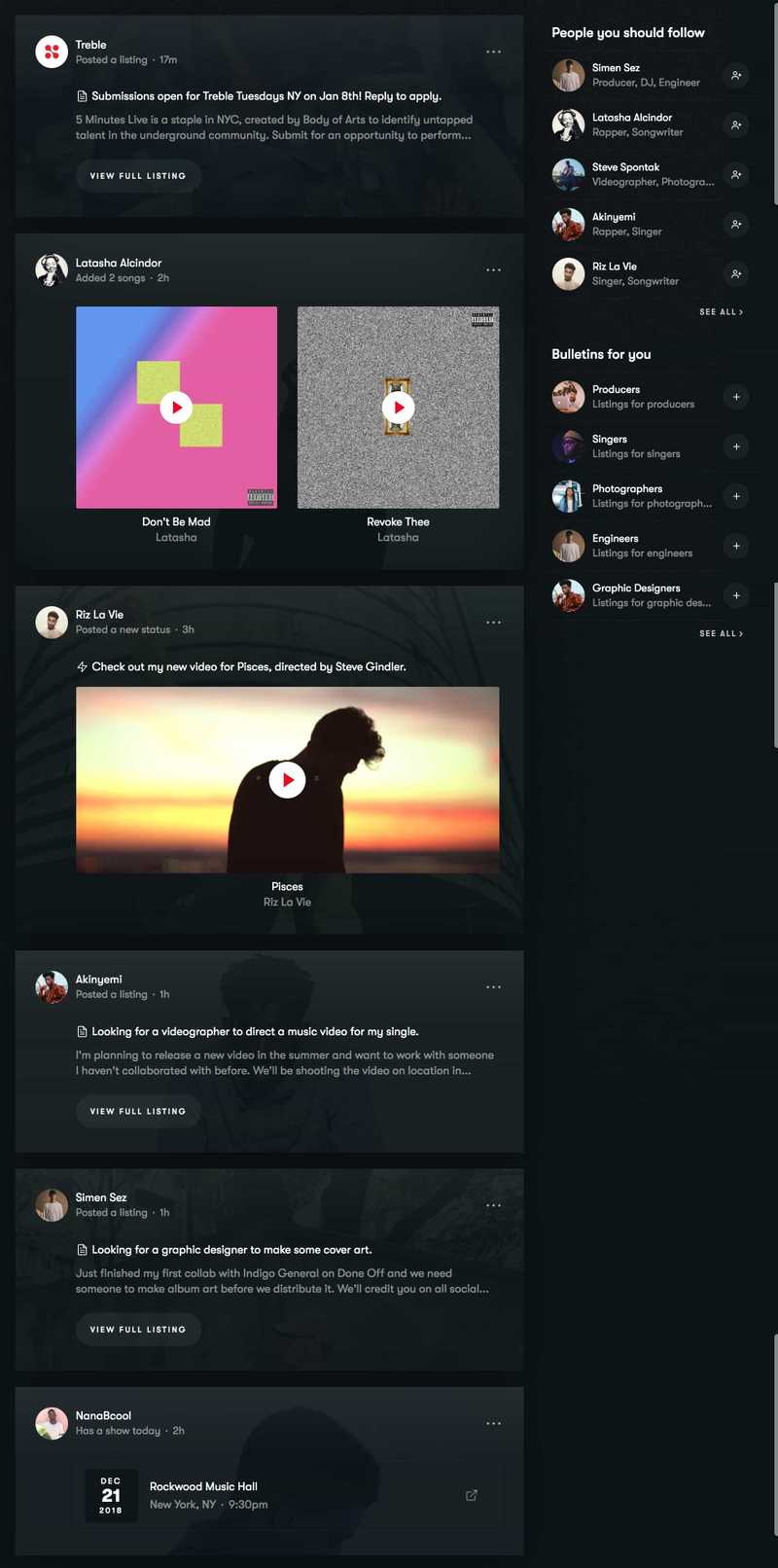
Although most people I interviewed liked the concept of Treble's listings — a Craigslist-style feed where users could post to find fill-ins for gigs, hire technical specialists for projects, or offer their own services — almost everybody agreed quality control was an issue. There were plenty of listings to sort through, but finding relevant and desirable opportunities was proving increasingly difficult in a feed that showed every listing posted by every user with minimal sorting options.
To tackle this problem, I redesigned the feed with two major changes. The first was to introduce the ability to follow other users and restrict the default feed to only show listings posted by people you follow, as well as any new work and collaborators published on their portfolios. From there, you could filter the feed to also include listings posted by others. The second new feature was bulletins, or role-specific listings based on location (i.e. 'Guitarists in LA'). This allowed users who were actively looking for work to view tons of relevant opportunities in addition to the community members they specifically followed.
Developing a series of pre-launch websites for the new Treble2019
While working on Treble's digital platform, I also designed, developed, and launched several websites. Some were landing pages for specific parts of the business, and others were to test usability or interest in features we were building into the platform.
Pre-launch landing page
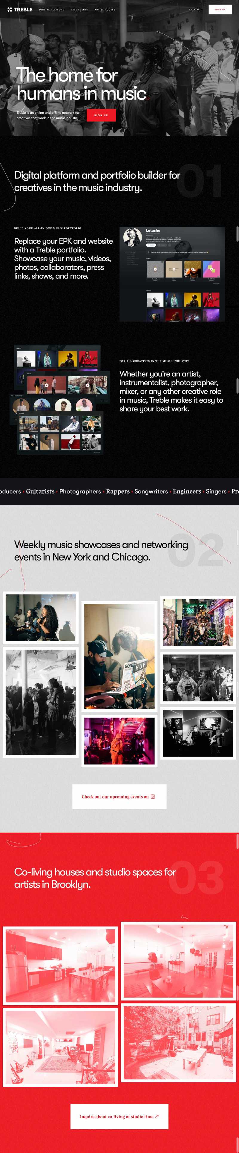
Treble's first official website was centered around the launch of the iOS app. Since that site was deployed, many different parts of the business had changed significantly. Most notably, we needed a new site to serve as a landing page for the redesigned digital platform, but it also had to provide context about how Treble's live events and soon-to-launch co-living and studio spaces fit into the company's bigger picture.
Under the constraints of a quick build and launch time, I opted to make a teaser site that cohesively broke down those three aspects of Treble's business with the plan of building each section out more when each respective offering publicly launched.
Opportunities website
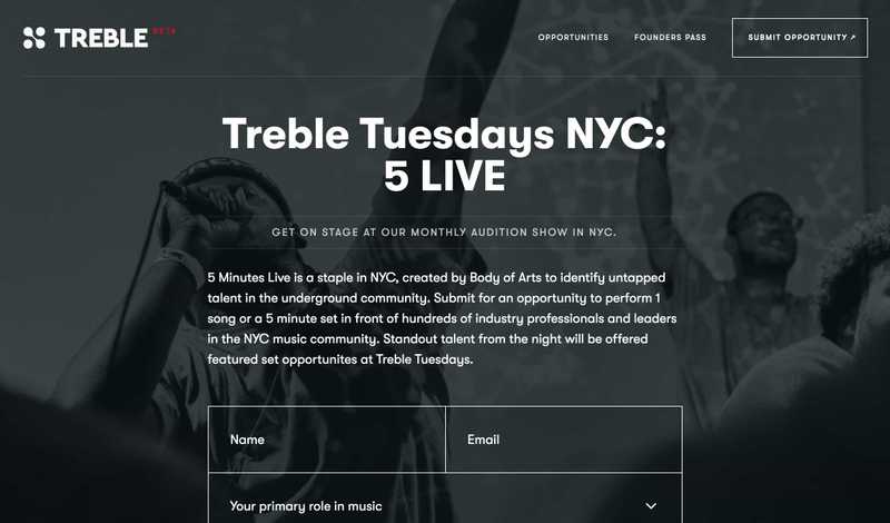
Before the launch of the platform beta, we wanted to start introducing the concept of Treble's sponsored opportunities to our live community, as well as be able to show a proof of concept to our partner companies to reach our audience. I built a website where we could quickly post opportunities and allow people to apply to them. I hooked up the forms to be able to collect responses on Netlify.
This site was a great way to test out different types of opportunities and optimize them before launching them as an in-app feature of the platform. It also helped build our email list, advance conversations with sponsors, and generate some excitement within our community about the quality of opportunities that would be available to them on the platform.
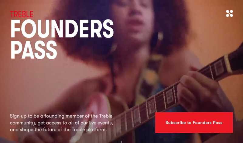
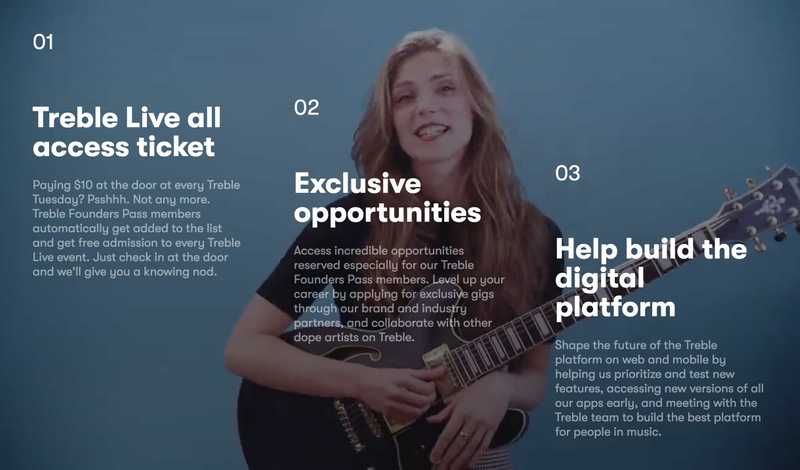
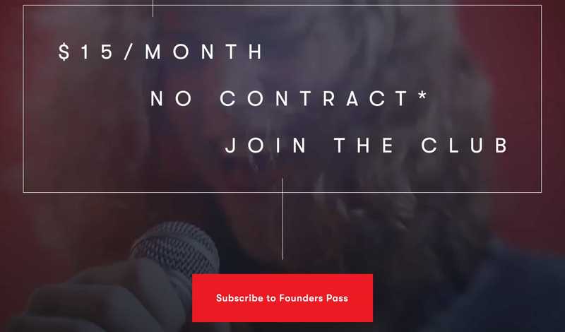
Treble Founders Pass
Every week, 50–150 people pay $10 at the door to enter Treble Tuesdays. We wanted to create a loyalty program of sorts for the regulars to sign up for a subscription that would give them an automatic ticket to all of Treble's live events, exclusive opportunities, and early access to the digital platform. I built a landing page and integrated it with Stripe to allow community members to sign up and pay for the subscription online.
Aside from being a discount for regulars and a source of revenue for the company, this site also helped us test out features of a premium subscription that we could later potentially integrate into the digital platform – and bridge the gap between the live and digital sides of Treble.
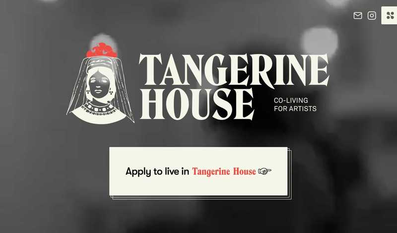
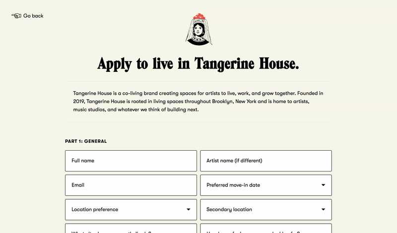
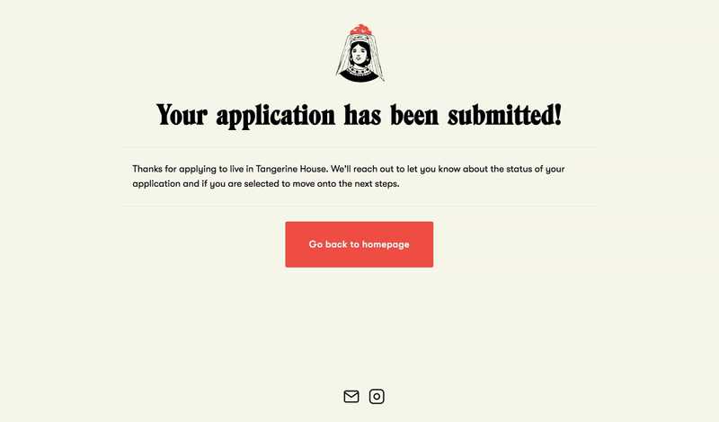
Tangerine House
In addition to the digital platform and live events, Treble partnered with Tangerine House, a company offering co-living and studio spaces for creatives in Brooklyn. With two houses already filled with tenants, Treble and Tangerine partnered on opening a flagship house. To prepare for this, I built a website for people to apply to live in one of the rooms, and integrated it with Netlify Forms for the house managers to easily review the applications.
Launching a more efficient, automated, and organized CRM2017
One of my former managers at Yelp reached out to me in early 2017 to help him with a new SaaS project. With over a decade in sales experience, he was deeply frustrated with every CRM system he used to keep track of his leads and wanted to build a new one that was far simpler to use, placed an emphasis on automating repetitive tasks, and was feature-rich enough to not require complicated outreach workflows.
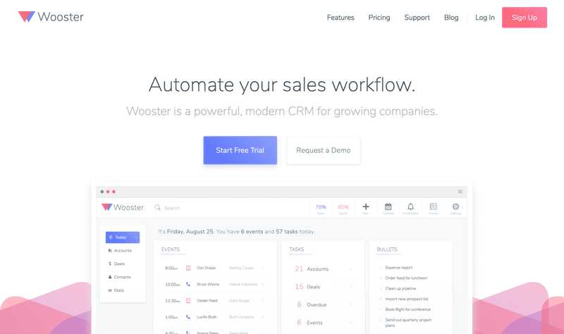
Having been equally as frustrated with my experience using what I felt was a bloated and unnecessarily complicated CRM in Salesforce (for my use cases), I agreed to help him synthesize his feature ideas into a focused, inuitive, and well-designed product. Over the course of six months, I designed a minimal, yet feature-rich CRM web app called Wooster.
Focusing on the essentials
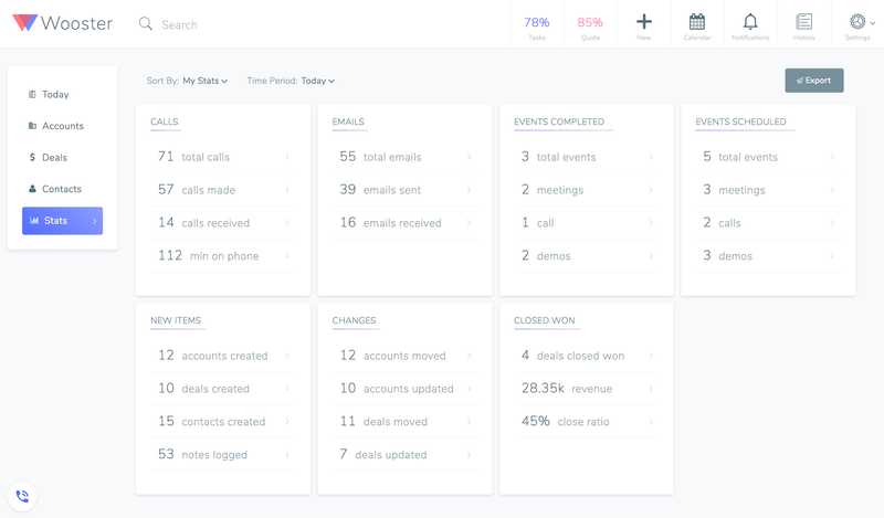
With our own experiences in sales — as well as research into just about every CRM on the market (and there are many!) and user interviews with dozens of sales professionals — we knew that one problem plagued most existing solutions: cluttered, overstuffed interfaces resulting in confusing user experiences. My primary challenge, then, in designing Wooster was to distill what is necessarily tons of content and data into the most minimal interface possible.
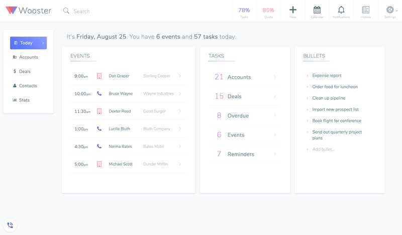
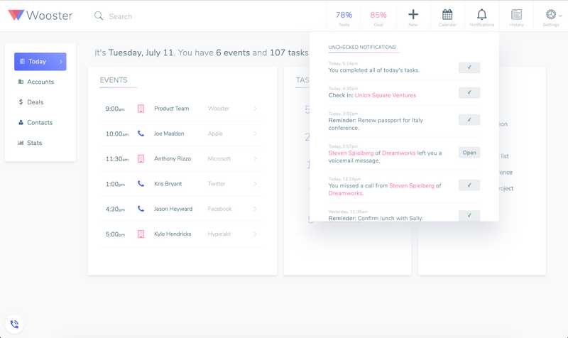
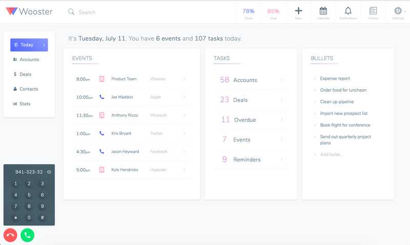
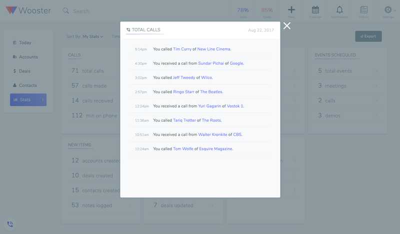
My solution was to make the homepage of the app an exceedingly simple dashboard with only the most necessary information: today's scheduled events, an automated set of tasks, and a quick-jot notepad. Rather than being confronted with thousands of context-less accounts, this dashboard would present you with only what you needed to focus on for that day.
Encouraging efficiency and organization
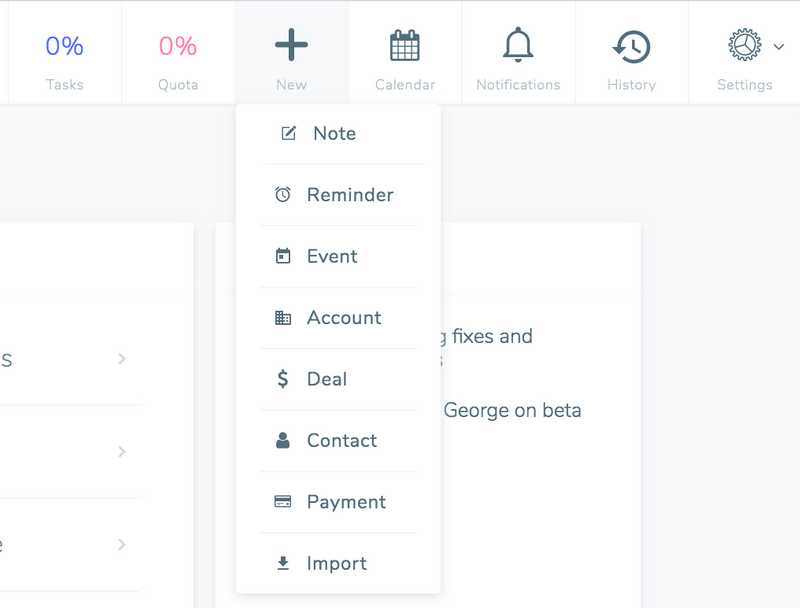
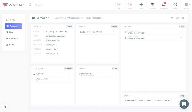
To make the user experience even more efficient, I designed a toolbar accessible from any page to add a new account, contact, deal, note, reminder, payment, and more. Rather than digging through a specific lead's detail page to log account-specific information, users can do so from any page. Wooster would sort the information into its proper location without a user having to navigate multiple screens.
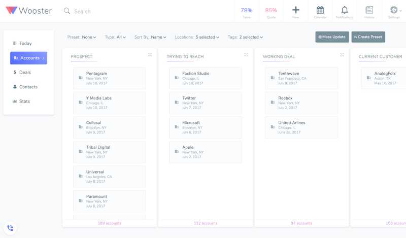
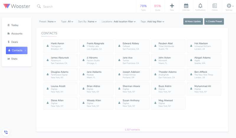
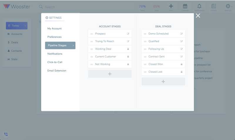
To help make managing thousands of accounts and contacts easier, I organized related pieces of information into a card-based interface: accounts are cards that can be dragged and dropped into different deal stages, and each account page contains cards representing contact information, deal status, events, and notes.
Building purposeful features
With so much data to account for and so many features customers considered essential for their CRM, it quickly became clear to me why so many CRMs suffered from cluttered user experiences. To me, the key in fighting against that was to be ruthless in deciding which feature belonged where and what information was absolutely essential on every screen.
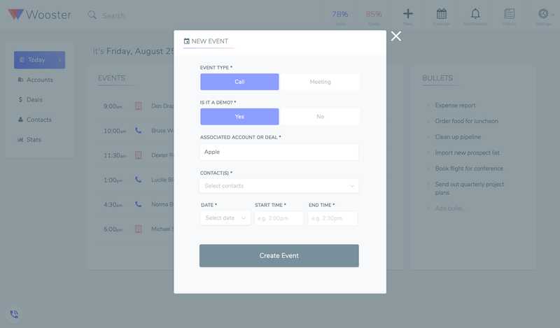
Ultimately, that meant pushing as many repetitive tasks into the background as possible, so that they would automatically declutter the experience for the user behind the scenes. I added the ability for a user to set up Wooster to automatically prompt them to reach out to certain leads based on custom time intervals, contextualizing what would otherwise look like an shapeless list of accounts. And rather than requiring complicated third-party integrations for call recording, email sync, and calendar management, I designed 'set-it-and-forget-it' workflows to bring those features in-app.
Miscellaneous projects, experiments, and practice with design and code2016–2020
These are some random tidbits of design and code I've worked on to learn something new, keep my skills sharp, or just for fun. They don't really have a home anywhere else, but it feels wrong to have spent time on them only to be hidden away on my computer. Some are ongoing side projects, and some were just one-off experiments. Have at 'em!